Most teams don’t lose users because their features are weak. They lose them because their interface quietly breaks trust.
That’s why design principles in SaaS aren’t about typography taste or spacing grids. They’re governance rules that prevent churn, token drift, feature bloat, and the “purple slop” effect that shows up when AI starts generating your UI faster than your system can support it.
If your product already ships fast but still feels fragile, inconsistent, or harder to scale with every release, you don’t have a speed problem. You have a principles problem.
Why Standard Design Principles Fail in B2B SaaS
Most design-principles lists still assume you’re designing a landing page.
That’s useless if you’re building a multi-role SaaS dashboard with API latency, edge states, and evolving component architecture. Enterprise interfaces don’t fail visually. They fail structurally.
The Lethal Cost of the “Lean MVP” Trust Deficit
“Ship fast and fix later” sounds efficient. It’s usually expensive.
Users evaluate credibility in milliseconds. A confusing MVP doesn’t validate your market. It hides your value behind friction and inflates churn before activation even begins.
High early churn is rarely a feature gap. It’s broken architectural UX.
If your onboarding flow collapses before users reach value, the data you collect about product-market fit is already compromised.
The “Purple Slop” Trap: Vibe Coding vs. Spec-Driven Architecture
AI generation solved blank screens. It also created indistinguishable interfaces.
Without constraints, most generators default to:
- generic Tailwind layouts
- inconsistent spacing logic
- drifting typography scales
- mismatched token hierarchies
That’s not acceleration. It’s technical debt disguised as progress.
A spec-driven workflow fixes this by defining structure before syntax. If you’ve seen how teams actually implement AI in production flows, you already know constraints not prompts determine quality. See how that plays out in real pipelines in how designers actually use AI in real projects.
Core SaaS Design Principles for Scalable Cloud Products
These aren’t aesthetic rules. They’re survival rules for products expected to scale.
- Enforce Design Tokens at the Infrastructure Level
Consistency should never depend on memory.
If a designer is manually checking border radius across 40 screens, the system is broken. Tokens must govern the interface programmatically.
Lock:
- spacing units
- typography scales
- color hierarchies
- component radii
Then export them directly into the codebase.
This prevents token drift across multi-screen flows and eliminates the slow bleed of UI entropy that accumulates release after release.
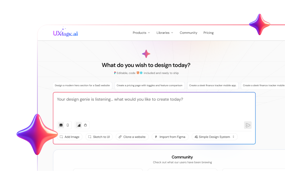
Tools like UXMagic enforce tokens as constraints rather than suggestions, so generated screens inherit the same visual DNA automatically instead of improvising styling mid-flow.
- Implement Progressive Disclosure for Enterprise Power Users
“Simplicity first” is lazy advice in B2B.
Enterprise users don’t want fewer tools. They want the right tools at the right time.
Progressive disclosure means:
- show essential KPIs immediately
- reveal advanced analytics inside workflows
- unlock expert controls as proficiency increases
This avoids the “Big Ball of Mud” dashboard that overwhelms new users while still supporting expert workflows.
It’s the difference between hiding complexity and sequencing it.
- Design for Discovery Without Triggering Feature Bloat
Feature visibility isn’t the same as feature usability.
A common anti-pattern: placing every new capability directly in primary navigation so it’s “easy to find.”
The result:
- cognitive overload
- slower onboarding
- reduced activation
- higher churn
Instead, layer discovery through:
- contextual tooltips
- workflow-triggered entry points
- role-based navigation
Discovery should feel earned, not forced.
- Mandate Contextual Memory in All AI Generation
Most AI UI tools forget your system by screen three.
That’s context window degradation. It causes:
- spacing drift
- typography swaps
- component misalignment
- hierarchy inconsistency
Flow-aware generation fixes this by maintaining layout logic across entire journeys instead of treating screens as isolated artifacts.
UXMagic’s Flow Mode solves exactly this problem by preserving spacing, hierarchy, and token logic from screen to screen so the interface doesn’t slowly mutate as it expands.
If you’ve ever corrected padding manually across ten generated screens, you already know why this matters.
- Prioritize State Management Over Aesthetic Polish
Static frames don’t survive production environments.
Real SaaS interfaces require explicit definitions for:
- loading states
- empty states
- error states
- API latency behavior
Most guides ignore these entirely. That’s why developer handoffs produce fragile builds.
Before generating React components, define system responses for failure conditions. Otherwise the application invents them later—and usually badly.
This is where spec-driven prompting patterns outperform generic exploration workflows like those described in real prompts we use for production-ready SaaS UI.
Executing the Spec-Driven Workflow: Scaling UI Without Token Drift
Modern design principles only work if the workflow supports them.
That workflow has four phases.
Pre-Generation: Locking the Component Architecture and Tokens
Before generating anything:
- audit the existing UI system
- extract reusable tokens
- map role-based information architecture
- define routing logic
This turns style guides into executable constraints instead of documentation nobody reads.
It also prevents generators from hallucinating layout rules mid-flow.
Flow Mode Execution: Preventing Context Window Degradation
Designing screens individually guarantees drift.
Designing journeys preserves structure.
Flow-aware workflows:
- maintain spacing logic
- preserve component hierarchy
- enforce typography continuity
- protect interaction patterns
UXMagic operates as architectural QA here by forcing teams to define transitions, empty states, and edge cases before code generation begins.
That single shift eliminates most hallucinated state logic during developer handoff.
If you’re still starting flows from scratch every time, you’re probably dealing with blank canvas syndrome instead of system governance.
Post-Generation: Seamless React Developer Handoff
Traditional handoff fails because designers deliver snapshots instead of systems.
Spec-driven pipelines export:
- token variables
- component structure
- interaction logic
directly into executable formats.
When bugs appear later, you update the spec not patch the code manually. That keeps the architecture stable as the product evolves.
It’s the difference between maintaining a product and babysitting a prototype.
Breaking the SaaS Growth Ceiling Through Architectural UX
There’s a mathematical ceiling on SaaS growth:
Maximum customers = acquisition rate ÷ churn rate
Most teams try to scale acquisition. Fewer fix churn.
Design principles affect churn directly.
Using Layered Onboarding to Slash Initial User Churn
Layered onboarding sequences complexity instead of dumping it.
Effective scaffolding:
- introduces only essential controls first
- delays advanced configuration
- adapts to user roles dynamically
As proficiency increases, the interface reveals deeper capability layers automatically.
This increases retention without reducing power-user flexibility.
Utilizing Micro-Interactions for Behavioral Engagement
Micro-interactions communicate system status before users feel friction.
Examples include:
- skeleton loading animations during latency
- confirmation feedback after actions
- contextual error messaging
Without them, users assume the system failed even when it didn’t.
Design principles aren’t visual polish here. They’re communication infrastructure.
Accessibility signals trust too. If your flows aren’t built with inclusive prompting patterns, you’re leaking retention silently. See how teams enforce that earlier in the process with prompting AI for accessible UI workflows.
Design principles aren’t visual guidelines anymore, they’re system constraints that protect your product from churn, token drift, and AI-generated inconsistency. Teams that lock tokens early, map flows before generation, and design for progressive disclosure ship faster and scale cleaner.
Design principles aren’t about making interfaces look better. They’re about making software survivable as it scales.
Generate Consistent UI Flows Without Token Drift
Stop fixing spacing, states, and hierarchy screen by screen. Generate full product flows with locked tokens and mapped edge cases using UXMagic.