You prompt an AI for a “clean, modern SaaS dashboard.”
It gives you 12px light gray text on white. Focus states you can’t see. 16x16px tap targets on mobile.
Then it proudly claims: “This component is accessible.”
If you’re shipping real software under WCAG 2.2 AA, you already know the problem isn’t motivation. It’s execution. AI defaults to aesthetic trends. Compliance requires math, structure, and constraint.
And generic prompts like “make this accessible” are worse than useless. They create a false sense of safety.
Let’s fix that.
The State of AI in Accessible UI Design
Why Generative AI Naturally Fails WCAG 2.2 Standards
AI models are trained on beautiful portfolios. Not compliant ones.
That means:
- Low-contrast typography
- Color-only differentiation
- Tiny tap targets on mobile
- ARIA slapped onto soup
It’s not malicious. It’s probabilistic.
WCAG 2.2 AA is deterministic.
AI optimizes for vibes. WCAG enforces ratios, pixel sizes, DOM order, and focus logic.
If you don’t inject those constraints early, you’ll accumulate technical debt faster than you can refactor it.
The Technical Danger of Post-Design Accessibility Audits
There’s a common myth:
“We’ll generate the app first. Then we’ll make it WCAG compliant.”
No.
If the DOM structure is wrong, no accessibility “polish pass” will fix it.
Automated scanners only catch 30–40% of violations. A Lighthouse 100 score does not mean usable.
Accessibility is not a layer. It’s an architectural constraint.
If you’re using AI for UI design, accessibility must be defined before the first pixel is generated.
How to Prompt AI for Visual Accessibility Constraints
Generic prompting fails because it’s vague.
You need structure.
Fixing Color Contrast Ratios with the CARE Prompting Framework
Stop writing:
“Make this button readable.”
Start writing:
Context
SaaS dashboard for aging users with declining vision.
Ask
Design a transaction table and filtering sidebar.
Rules
- All text must meet 4.5:1 contrast (WCAG 1.4.3)
- All focus indicators must meet 3:1 contrast (WCAG 2.4.13)
- No color-only differentiation (WCAG 1.3.3)
Examples
If using light blue background, use dark navy or black text.
Spell out the math. Spell out the rule numbers. Force constraint.
AI does not “remember” WCAG nuances unless they’re in the current prompt window.
Enforcing Minimum Target Sizes and Touch Area Padding
AI loves to shrink everything on mobile.
That’s how you get 16x16px icons with zero spacing.
Explicitly command:
- Minimum 24x24px interactive targets (WCAG 2.5.8)
- Adequate padding around clustered icons
- Vertical stacking without horizontal scroll (WCAG 1.4.10)
If you don’t write it, you won’t get it.
Prompting for Code Structure and Keyboard Navigation Logic
Visual compliance is meaningless if the exported code is chaos.
Generating Semantic HTML and Valid ARIA Roles
AI will:
- Nest 12 elements
- Add role="button"
- Call it accessible
Don’t let it.
During export, prompt:
- Use
- Avoid replacing native semantics with ARIA
- Map layout groups to meaningful DOM order (WCAG 1.3.2)
Semantic structure beats decorative ARIA every time.
If you want a deeper breakdown on production-ready export, see our guide on generating production-ready React code from Figma.
Structuring Focus States and Avoiding Keyboard Traps in Modals
By default, AI ignores the z-axis.
You must explicitly request:
- Logical tabindex order (WCAG 2.4.3)
- Visible 2px focus rings (3:1 contrast)
- Strict focus trap in modals
- Escape key returns focus to trigger
- No keyboard traps (WCAG 2.1.2)
Example constraint:
“When modal is open, Tab cycles only within modal. Escape closes and returns focus to original trigger.”
If you don’t define focus behavior, keyboard users will fall straight through your interface.
Designing for Cognitive Accessibility and Reduced Motion
Accessibility isn’t just contrast and tap targets.
It’s cognitive load and motion safety.
Implementing prefers-reduced-motion in AI Code Exports
AI loves:
- Parallax
- Infinite animations
- Autoplay transitions
You must require:
@media (prefers-reduced-motion: reduce) { animation: none; transition: none; }
Without this, you’re actively harming users with vestibular disorders.
Never rely on AI to remember this on its own.
Preventing Redundant Data Entry in AI-Generated Forms
Cognitive accessibility means reducing memory strain.
Bad AI behavior:
- Billing address retyped manually
- Floating labels that disappear
- No autocomplete attributes
Correct prompt constraints:
- Persistent labels above inputs (WCAG 3.3.2)
- “Billing same as shipping” toggle (WCAG 3.3.7)
- Correct HTML autocomplete attributes
- Error states include icon + text + border change
Minimalism is not an excuse for cognitive friction.
Integrating UXMagic for Scalable, Inclusive Product Design
Here’s the uncomfortable truth:
Generic chatbots are not built for component-level accessibility refinement.
They don’t understand spatial context. They regenerate entire screens to fix one button.
That’s where workflow matters.
Global Accessibility Enforcement via AI Style Guide Generator
In UXMagic, you can define:
- WCAG-compliant color tokens
- Accessible typography scales
- Structural spacing variables
Once set, these constraints are enforced across all generated screens.
No more fighting “Dribbble Bias.” No more fixing the same contrast issue 17 times.
If you’re exploring how to build AI-powered design systems, this becomes foundational.
Granular Remediation via Sectional Editing
When you find a localized issue:
Don’t regenerate the whole page.
Use sectional editing to:
- Isolate the nav
- Increase target sizes
- Adjust focus state contrast
Without touching typography or layout tokens.
Accessibility fixes shouldn’t destroy your brand system.
Cognitive Consistency via Flow Mode
WCAG 3.2.3 and 3.2.4 require consistency.
Primary actions must look and behave the same across flows.
UXMagic’s Flow Mode keeps:
- Navigation patterns consistent
- Button styles uniform
- Layout structure predictable across pages
Predictability reduces cognitive load.
And that’s accessibility.
The Real Shift
Stop treating accessibility as a cleanup task.
Start treating it as a prompt constraint.
AI will not protect your users. It will optimize for aesthetics unless you force it not to.
If you’re building with AI, define your WCAG constraints upfront and generate within them.
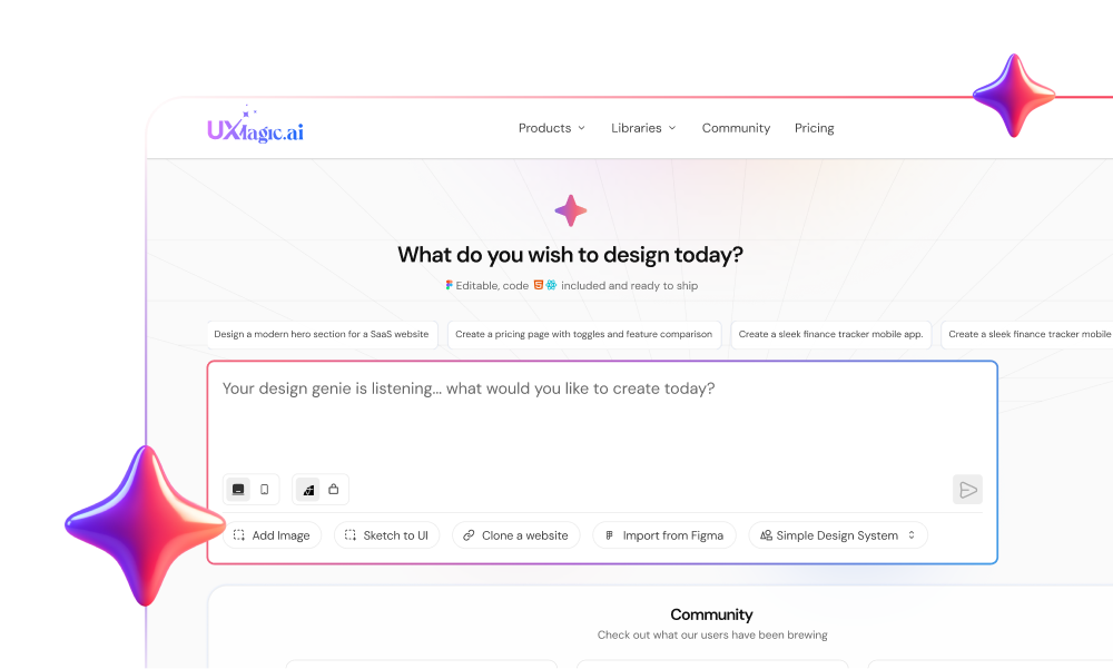
Try UXMagic and enforce accessibility at the system level not as an afterthough
Design Accessible UI with AI
Create interfaces that meet accessibility standards from the start. Build consistent, WCAG-compliant UI flows without breaking your design system.